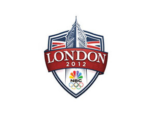
As some of you may remember, last year I started a project to compile a list of the U.S. Olympic Broadcaster Logos used over the years. These are not the logos of the Olympic locations themselves, but rather what CBS, ABC, and NBC used to brand their coverage.
I found it odd at the end of the 2010 Vancouver Olympics that NBC didn't tease the look of their 2012 London logo as they usually do. However, I think I may have come across it today.
As part of all the coverage about the Olympic TV bids, I watched a video on NBCOlympics.com. At the end of the video, the above logo appears. Did a little searching online and found a cleaner version on an NBCUniversal human resources website.
When I get a better quality version, I'll be adding it to the archive.


Waaaaaaaaaaaaay better than the official London Olympics logo which gives me a migraine just thinking about it.
Wait. So the logo doesn't vibrate? Or have abstract shapes? I'm disappointed.